As a DTC business, your brand’s website is the very heart of your operations. It introduces prospects to your products, showcases your brand, and keeps your shop up and running 24/7 — no matter where your customers are based.
Creating an always-open conversion machine that appeals to modern consumers is easier than you think. It’s all about achieving the right combination of website elements to draw customers and data to help you optimize performance.
Build a High-Performing DTC Website With These 10 Essential Elements for Success
Consider these small, strategic website updates aimed at priming your digital presence for conversions.
A Show-Stopping Headline
No matter how big and bold your headline may be, your website has mere seconds to make a winning first impression.
The best headlines instantly tell the what while communicating a benefit that solves a pain point. The tried and true formula for a winning headline is all about putting yourself in the shoes of your target audience. Then ask yourself, “What is the problem they’re trying to solve?” or “What do they want?” If your headline solves that problem or achieves their goals in an impressively short number of characters, you’re golden.
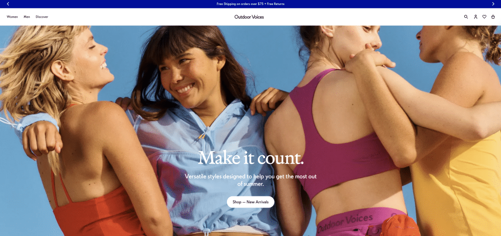
Example from Outdoor Voices
A Compelling Offer
When you construct your DTC website, ask yourself, “What about this page will motivate visitors to buy or engage now?”
Limited quantities complemented by a countdown create an instant sense of urgency, especially when added to the header section. Alternatively, discounts with a deadline can achieve that same effect.
If you’re not inclined to promote a limited-quantity item or provide a discount, consider leveraging a content offer like a summer style guide that shows how to wear and pair pieces from your latest clothing line or, if you’re an outdoor goods company, a camping-themed cookbook that incorporates some of your take-along wares. This provides you the opportunity to grow your email list and cultivate relationships with visitors beyond this initial engagement.

Example from Warby Parker
Clear CTAs
As a DTC business, your website’s CTAs transport your prospects to your desired destination: their shopping cart. Your CTA should be crystal clear and strikingly bold. In a single word, unmissable.
Here’s where your CTA can really drive conversions:
Header
Place a prominent CTA button in your header that visitors will see the moment they land on your page.
Product Spotlight
Pair each product listing with a “Buy Now” or “Add to Cart” CTA.
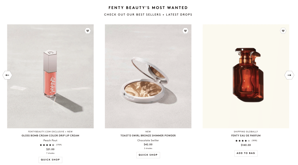
Example from Fenty Beauty
Sticky Navigation
Add urgency with a sticky nav that includes a sale or quantity countdown along with a “Checkout Now” button.
Footer
Use the final portion of your landing page to convey your CTA one last time. You can also offer ways to connect beyond their page visit like a social media invitation.
A Page Exit Pop-Up
Don’t let visitors leave your pre-sell landing page without giving them one last chance to convert. Be sure to include some sort of discount or content offer.
Pain Points, Resolved + Value-Boosting Benefits
- Your headline
- Subheadlines
- Customer testimonials
- Product descriptions
- Video
- Photos
- Comparison charts
Consider your pain points and benefits a dynamic duo. Together, they tell the story of just how game-changing your products are to your target consumer. And when done right, serve as the stocking point for every successful website.
Scroll-Stopping Imagery
Visitors are 80 percent more likely to read content when it’s paired with colorful visuals, so high-quality, professional photos, imagery, and design are critical to creating a website page that converts.
The practice of show and tell for your products should always have a strong focus on the show, as many DTC brands credit their growth to their investments in posting on hyper-visual social media platforms like Instagram, Facebook, and TikTok.
Bite-Sized Videos
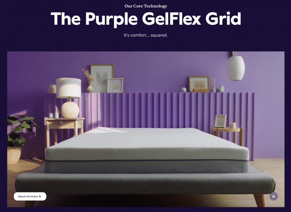
Example from Purple
- Lightning-fast product demos
- Customer testimonials
- Backgrounds on your page
Your landing page video doesn’t need to be more than 30 to 60 seconds long. If you’d like to try a more in-depth demo, consider an A/B test to see if keeping it quick is a better bet.
Social Proof
Considering that 92 percent of customers read online reviews before they make a purchase, adding testimonials and reviews to your pre-sell landing page can give them the information they need without them having to leave.
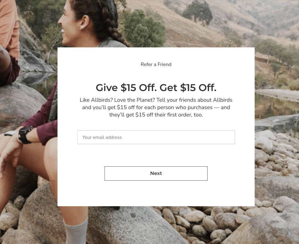
Example from Allbirds
Convincing Comparisons
Another way to keep visitors on your website is to line up their pain points and greatest wishes related to your product and compare how yours stacks up against your competitors. This way, they won’t dare go to the other guy’s site because the information you provided upfront – from social proof to the comparison chart – lets them know there’s only one way to go, and that’s with you.
Non-Committal Ways to Connect
Your website should accommodate visitors who prefer to keep it casual. You don’t need to achieve a sales conversion on the first go with everyone. Instead, provide options like those below that enable you to stay in touch and make the sale later.
Email capture
Obtaining visitors’ email addresses provides you with the opportunity to re-engage with fresh product offerings, compelling discounts, and content that brings customers closer to your brand. Convince casual visitors to provide their email address with a newsletter sign-up offer like Olipop (Score 10% off your purchase when you join our email list!) or a compelling content offer (Download our just-released 2022 Most-Loved Summer Recipes Sheet!).
No matter what type of email capture opportunity you provide, be sure to have follow-up nurture emails tailored to new email subscribers and/or the content they decide to download. Of course, no one has the time to reply to dozens of prospects per day or more, so many teams rely on marketing automation to manage their nurture campaigns for them.

Example from Olipop
Social media
There’s lots to like about the social media invite, or “Let’s be friends” invitation. For website visitors, the effort involves nothing more than tapping “Follow,” something they already do with lots of brands that catch their eye.
For your DTC business, once they’re your friend, you’re in! Think about it: What better way to stay top-of-mind for your website visitors than to pop up in their Instagram feed each day? But getting the connection won’t necessarily earn you the conversion. From the moment they tap “Follow,” your social media strategy will either make or break your relationship. This is where eye-catching imagery, hyper-branded content, and user-generated posts come into play.
A Simple Checkout Experience
The average cart abandonment rate hovers between 70 and 86 percent, depending upon a customer’s device. Regardless of how awesome your website is, if your checkout flow is cumbersome, you’re bound to lose a lot of sales.
Consider these simple moves to help you create a checkout experience that’s convenient for customers and conversion-ready for your business:
- Ditch required registration and offer guest checkout
- Provide multiple payment options from credit cards to PayPal and Apple Pay
- Offer a single-page checkout to avoid the risk of bounces
- Leverage the ease of Google’s auto-address fill
- Lure customers who try to leave with a pop-up discount code
- Ensure your checkout page is mobile-responsive
While these suggestions are simply the start of a great checkout experience, you should see instant improvements once you implement them.
Test Your Website Performance With Heat Mapping
Heat mapping tracks visitors’ engagement on your website. Using “hot” red and “cool” blue, heat maps can help your brand pinpoint which content on your website captures visitors’ attention and drives action, along with exposing lagging content and creating opportunities to do more with that real estate.
Specifically, heat maps measure:
- How long a visitor remains on your website
- The moment they begin to scroll
- Areas their mouse hovers over or fingers touch
Popular heat map tools include Hot Jar and Crazy Egg. Do some research with your team to find which tool will best equip you to achieve your website goals.
Once you’ve picked your product, use this heat-mapping metrics guide to help you pair heat maps with the metrics that matter most. Once you’ve set them up, your heat maps will reveal exactly what you should replicate throughout your site, along with lower-performing areas you’ll want to update.


