When Should You Opt for a Pre-Sell Landing Page?
Pre-sell landing pages are a better choice when your brand has something specific to say because they empower your business to highlight specific products, pain points, benefits, and offers to appeal to a specific target. For example, a pre-sell landing page would best suit:
A pre-launch campaign
Generate buzz before a product’s big debut by empowering interested buyers to learn more, shop the line, and reserve items via pre-order.
A new product launch
Cut away from the clutter of your website by directing your launch campaign to a dedicated landing page that showcases your fresh product’s features and benefits.
A product line promotion
Give your line space to shine with a landing page packed with product shots and testimonials. A dedicated page can hyper-target those most likely to buy and engage.
A dedicated sale for exclusive items (AKA “Flash sale” or “Drop”)
A landing page harnesses the hype of flash sales and drops by placing limited items on display, honing in on time and quantities left, and driving sales through urgency.
A special sale day
Ramp up success on days like Black Friday with a landing page that exclusively curates top deals, shows off one-day steals, and answers holiday FAQs.
10 Essentials for a Successful D2C Pre-Sell Landing Page
Your pre-sell landing page is valuable real estate, and it pays to treat it that way. Consider some of these conversion-oriented page elements inspired by Caraway cookware’s stunning pre-sell page as you map out what will become the crux of your next hit campaign.
A Show-Stopping Headline
A Compelling Offer
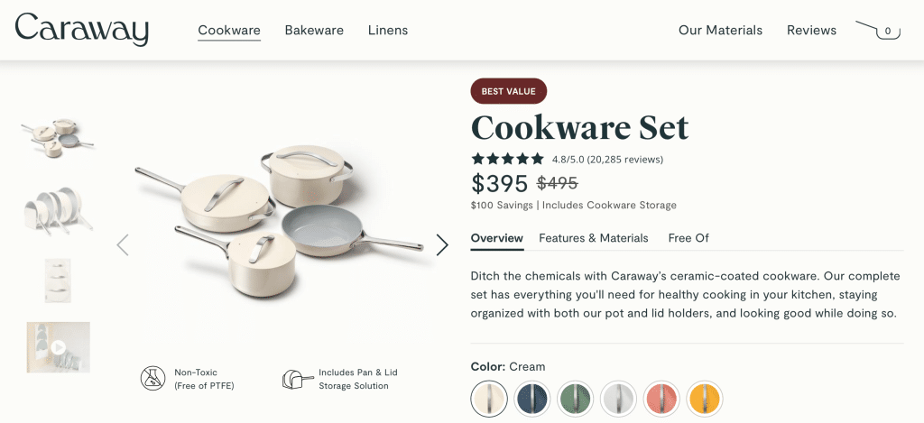
Example from Caraway
If you’re not inclined to promote a limited-quantity item or provide a discount, consider leveraging a content offer. This provides you the opportunity to grow your email list and cultivate relationships with visitors beyond this initial engagement.
A Clear CTA
Header
Place a prominent CTA button in your header that visitors will see the moment they land on your page.
Product Spotlight
Pair each product listing with a “Buy Now” or “Add to Cart” CTA.
Sticky Navigation
Add urgency with a sticky nav that includes a sale or quantity countdown along with a “Checkout Now” button.
Footer
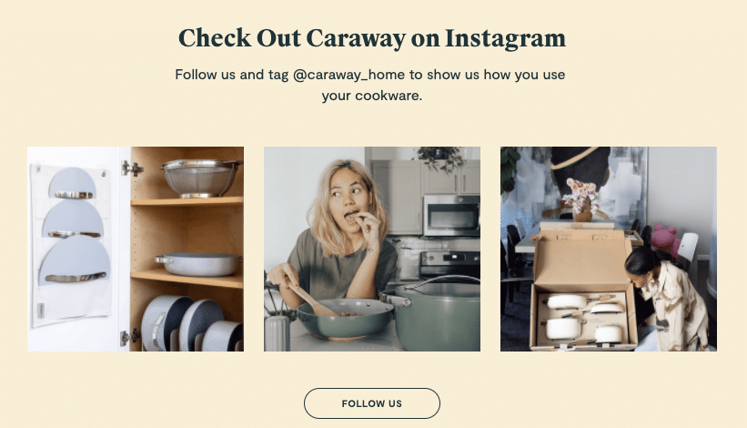
Use the final portion of your landing page to convey your CTA one last time. You can also offer ways to connect beyond their page visit like a social media invitation.
A Page Exit Pop-Up
Add urgency with a sticky nav that includes a sale or quantity countdown along with a “Checkout Now” button.
A Strategic Curation of Products
A landing page has limited space, so it’s important to ensure that the products it features align with the goal of your page. For example, your product launch page should only include that product. Your product line page should solely focus on a single line. Rather than burying them among the hundreds of items on your site, your landing page makes them the star of the show. Now, what to do with all that extra space? Consider adding some or all of the options below.
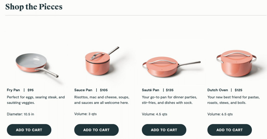
Example from Caraway
Pain Points, Resolved + Value-Boosting Benefits
- Your headline
- Subheadlines
- Customer testimonials
- Product descriptions
- Video
- Photos
- Comparison chart
Consider your pain points and benefits a dynamic duo. Together, they tell the story of just how game-changing your products are to your target consumer. And when done right, serve as the stocking point for every successful pre-sell landing page.
Scroll-Stopping Imagery
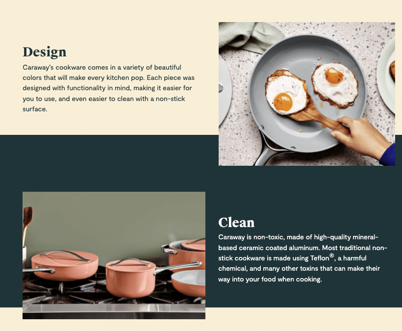
Example from Caraway
Bite-Sized Videos
- Lightning-fast product demos
- Customer testimonials
- Backgrounds on your page
Your landing page video doesn’t need to be more than 30-60 seconds long. If you’d like to try a more in-depth demo, consider an A/B test to see if keeping it quick is a better bet.
Social Proof

Example from Caraway
Convincing Comparisons
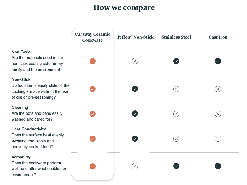
Example from Caraway
Non-Committal Ways to Connect
Email capture
Social media
